We’ve all admired the classic Swedish minimalist design – all light airy rooms, with splashes of colour to add warmth and cosiness. But what is so special about Swedish design and architecture and why are the Swedes so good at it?
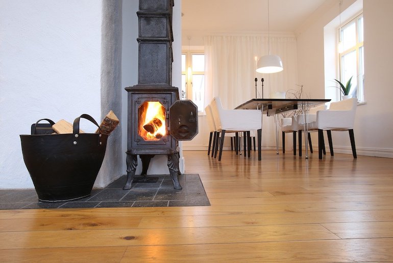
What makes Swedish design so good?
Simplicity, functionality and accessibility are the key elements of Swedish design, and it is these elements which contribute to the contemporary neutral look that is prevalent in many modern Swedish buildings. But this contemporary-looking aesthetic stems from further back that you may think.
Sweden embraced the Bauhaus design movement of the early 20th century and the modernist look of the 1950s, and combined these with ideas from writer Ellen Key’s 1899 book Skönhet För Alla (Beauty For All). In this work, she advocated homes decorated in simple, light colours with functional furniture.
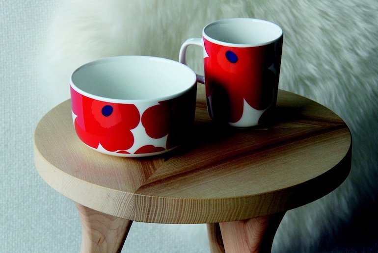
She believed that the way we live in our homes has an undeniable impact on our health and wellbeing. Although a commonly held belief now, this was ground-breaking at the end of the 19th century. The interplay of these ideas bore the interiors that we know today as typically Swedish: light, airy, functional and accessible to all.
Ikea can be seen as the epitome of this movement, but in fact it runs throughout Swedish design, from Ikea right up to the high-end furniture and textiles of mid-century Swedish designer Carl Malmsten.
What is Swedish design and architecture like?
Swedish interiors use light, textures and natural elements to create an inviting and comfortable living environment.
It’s not unusual to see an otherwise modest interior brightened up by bold fabrics – Gustavian blue and white checks, traditional folk floral designs (kurbits, or patterns from nature), the dynamic glassware that Sweden is known for (Kosta Boda and Orreförs), or the ubiquitous dalahäst (Dalecarlian horse) ornament.
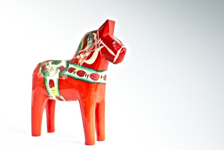
Although this look is sometimes mistaken for minimalism, there is far more to Swedish interiors. In fact, they often embrace the reverse, with beloved possessions displayed on a String shelving system or bright, boldly patterned fabrics used to contrast the simple upholstery of a sofa or chair.
This marriage of simplicity, functionality and accessibility is one of the reasons for the enduring popularity of Swedish interior design. While minimalism can feel like a challenging goal to attain, the Swedish look allows a degree of fun alongside its sense of order and calm.
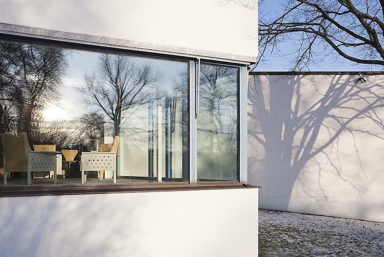
Light is one of the key elements in Swedish design for good reason: the Swedish winters can be long and dark.
The further north in the country you go, the truer this becomes, until you reach the tip of Sweden, where the sun makes only a twilight appearance for four hours a day in the winter months.
Light then plays an essential role in Swedish homes, created both electrically and by candles, which have become a major component of Swedish interior design.
Why are traditional houses red in Sweden?
At first glance, the red cottages and houses that dot the Swedish countryside and the pared-back and naturally toned aesthetic that dominates inside many a Swedish home might not seem related, but they share a common DNA.
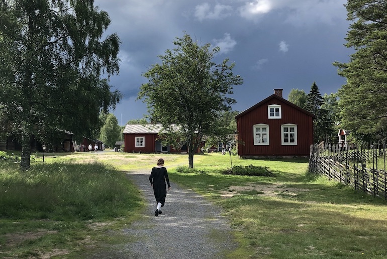
Despite their contrasts, they have the same source: simplicity and ease. That red paint that is so familiar across the Swedish countryside is called Falun red, its name stemming from the mining city where it is from.
In the 18th century, the miners discovered that the waste product (rödmull – red soil) from the iron oxidation process at Falun’s enormous iron mine was a great preserver of wood. Rödmull is now used to make the ubiquitous Falun red paint used on houses and cottages the length and breadth of the country.
To see these distinctive red cottages at their best, visit the Gammelstad Church Town (Gammelstads Kyrkstad), a UNESCO World Heritage Site just outside Luleå, where more than 400 red wooden houses, built around a fifteenth-century stone church, have been preserved as an open-air museum.
There’s more about Sweden’s red houses in this guide!
Where can I see great Swedish design and architecture?
Swedish buildings have displayed a distinctive look over time, with impressive examples of architecture dating back as far as the twelfth-century, when the Romanesque Lund Cathedral in Skåne was built.
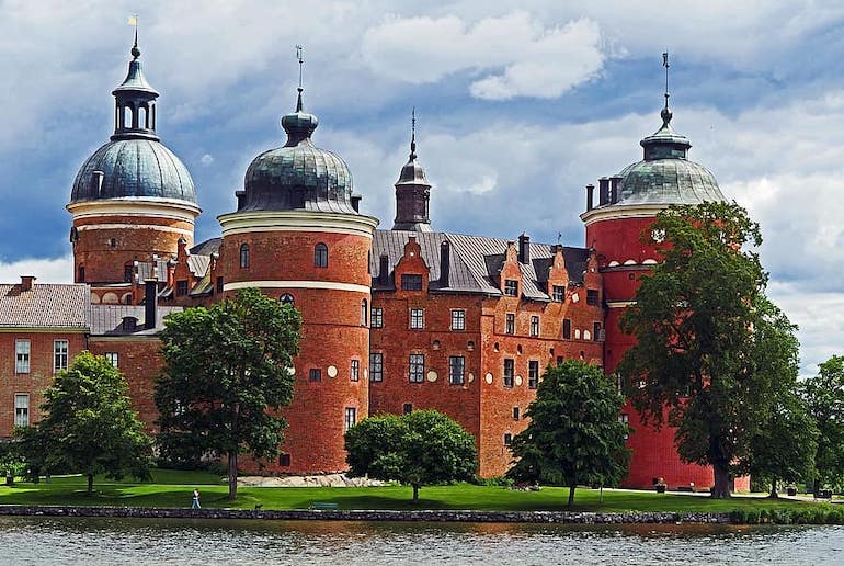
Gustav III’s classical theatre at Gripsholm Castle dates from the eighteenth-century, while the neo-classical Stockholm City Library by Gunnar Asplund is the epitome of 1920s Nordic architecture.
Tying together functionality and beauty, the home of artists Carl and Karin Larsson just outside Falun is an icon of late nineteenth-century Swedish design, as experienced by ordinary families.
By contrast the extravagant Hallwylska Palace, designed by Isak Gustaf Clason, Sweden’s best-known architect of the time, is an example of architecture from a similar period, but where money was no object.
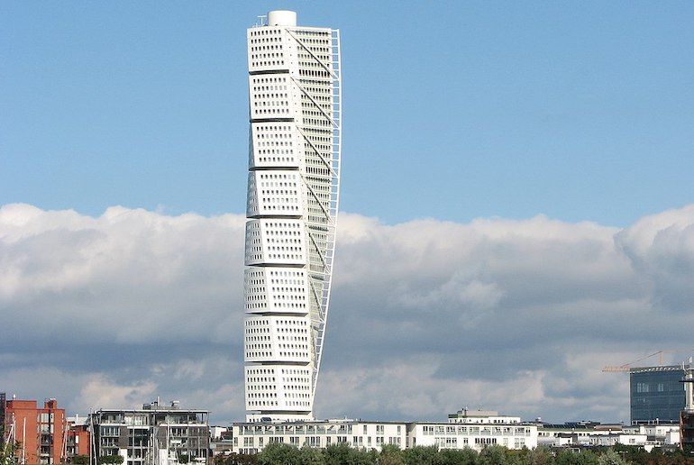
Malmö is a good base for lovers of contemporary architecture, as it’s home to the ground-breaking Turning Torso tower in Västra Hamnen, the world’s first “twisted” skyscraper, and the vast Emporia shopping mall, whose centre appears to be melting.
This guided tour takes in two great examples of Swedish architecture, separated by nearly a thousand years – Lund’s ancient cathedral and Malmö’s ultra-modern twisting tower.
Kiruna, in the north of the country, has also placed itself squarely on the contemporary architecture map.
As part of a decades-long project to move the city 3km from its current location, many new buildings are springing up, including the centrepiece Kiruna City Hall, known as “the Crystal” by architect Henning Larsen. For more on the city, check out our guide to what to do in Kiruna.
For beautiful interior designs ranging from textiles to lighting and tableware, Svenskt Tenn is a Stockholm institution that sits somewhere between an interiors store and a museum.

